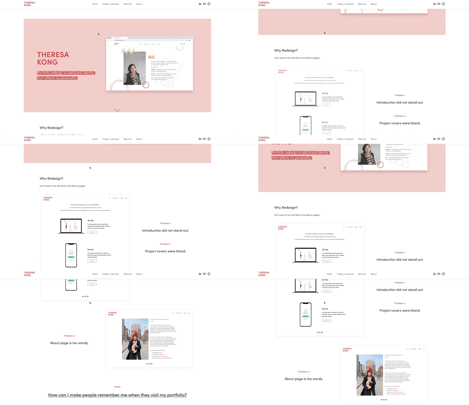
Why Redesign?
Let’s look at the older portfolio.
Problem 1
Introduction did not stand out.
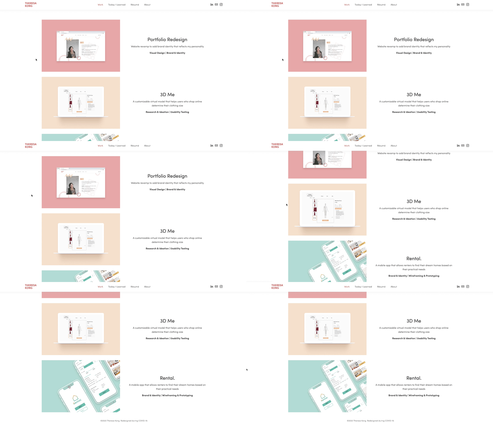
Problem 2
Project covers were bland.
Problem 3
About page is too wordy.
How can I make people remember me when they visit my portfolio?
Establish My Brand and Identity
Brand Color
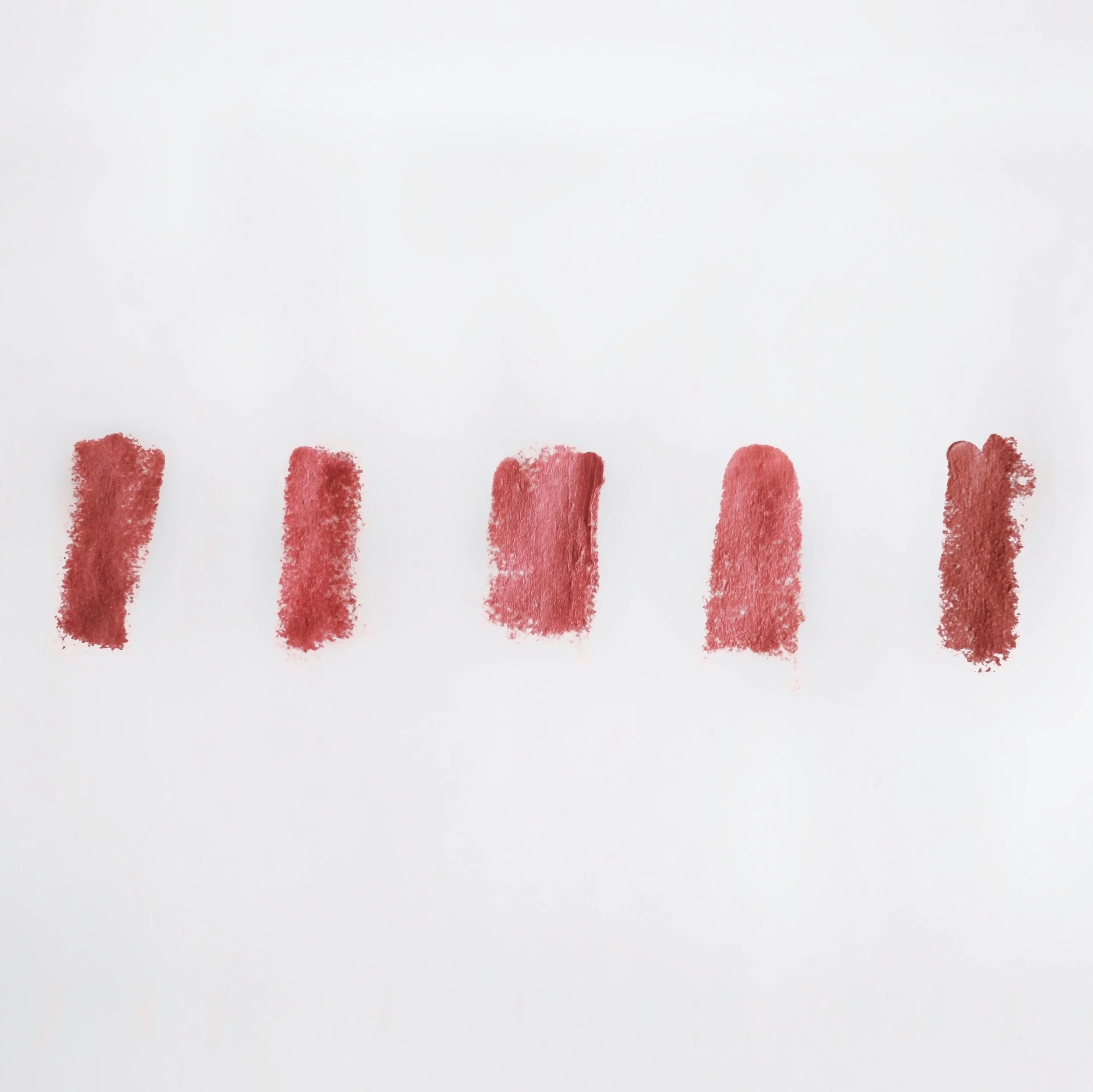
My “brand color” should represent me well. To identify it, I found a pattern based on what I usually wear.
Me wearing a red hat
My most used lipsticks
More Inspiration
Mood Board
To better reflect my personality, I identified secondary colors and tone words.
Graphic Elements
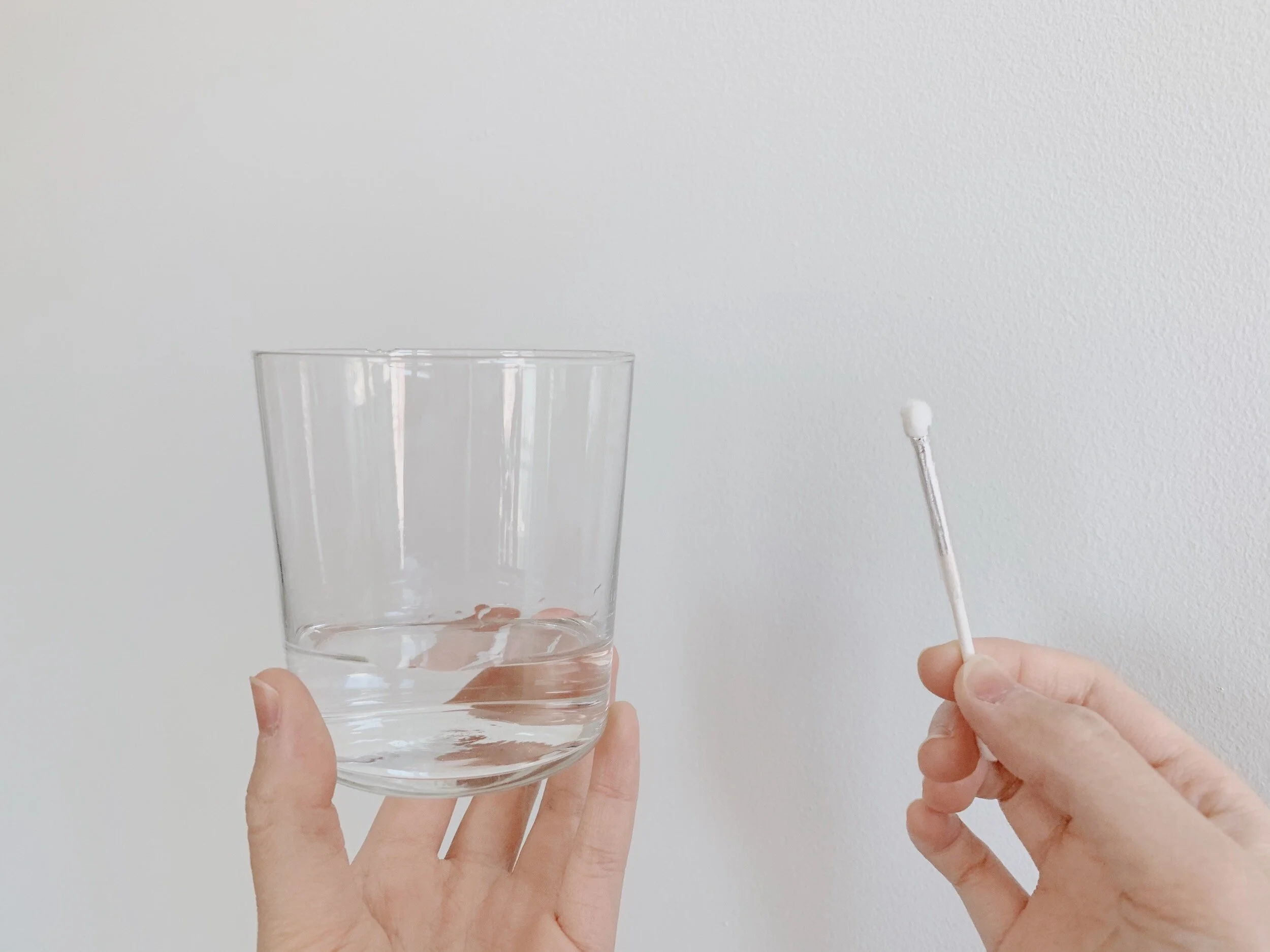
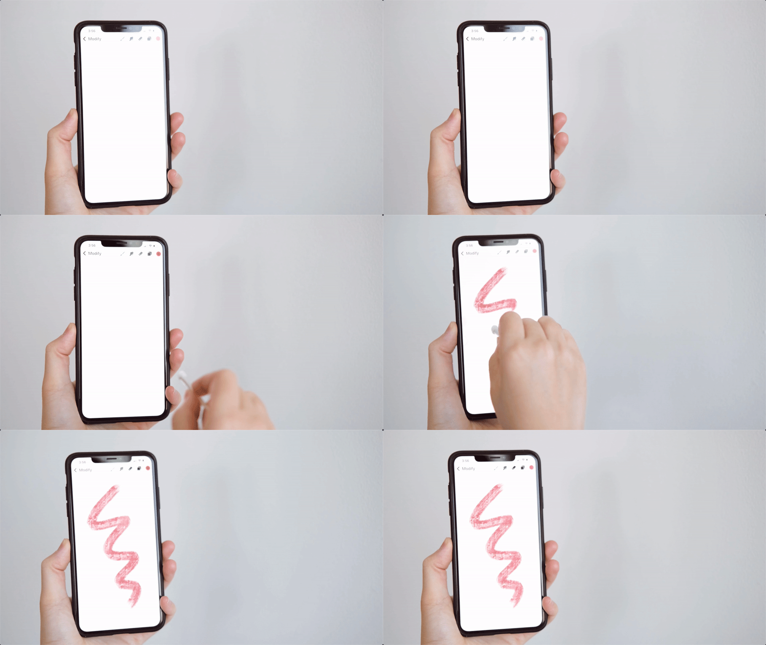
I wanted to draw my own graphic elements to decorate the website. Since I don’t have a stylus, I made my own using a cotton swab wrapped in aluminum foil, then dipping it in a glass of water. This makes my drawings more precise compared to using my own fingers.
Style Guide
Problem 1: Introduction did not stand out
Solution: Make hero messages speak more volume
Made landing page bigger
Defined typography
Added my own illustration
Defined my principles
Problem 2: Project covers were bland
Solution: Incorporate project brand colors while standardizing consistency and uniformity
I used each project’s brand color as the background color, then I readjusted all colors to achieve a consistent pastel look altogether. To complement, I also made sure to use lighter colored devices for uniformity.
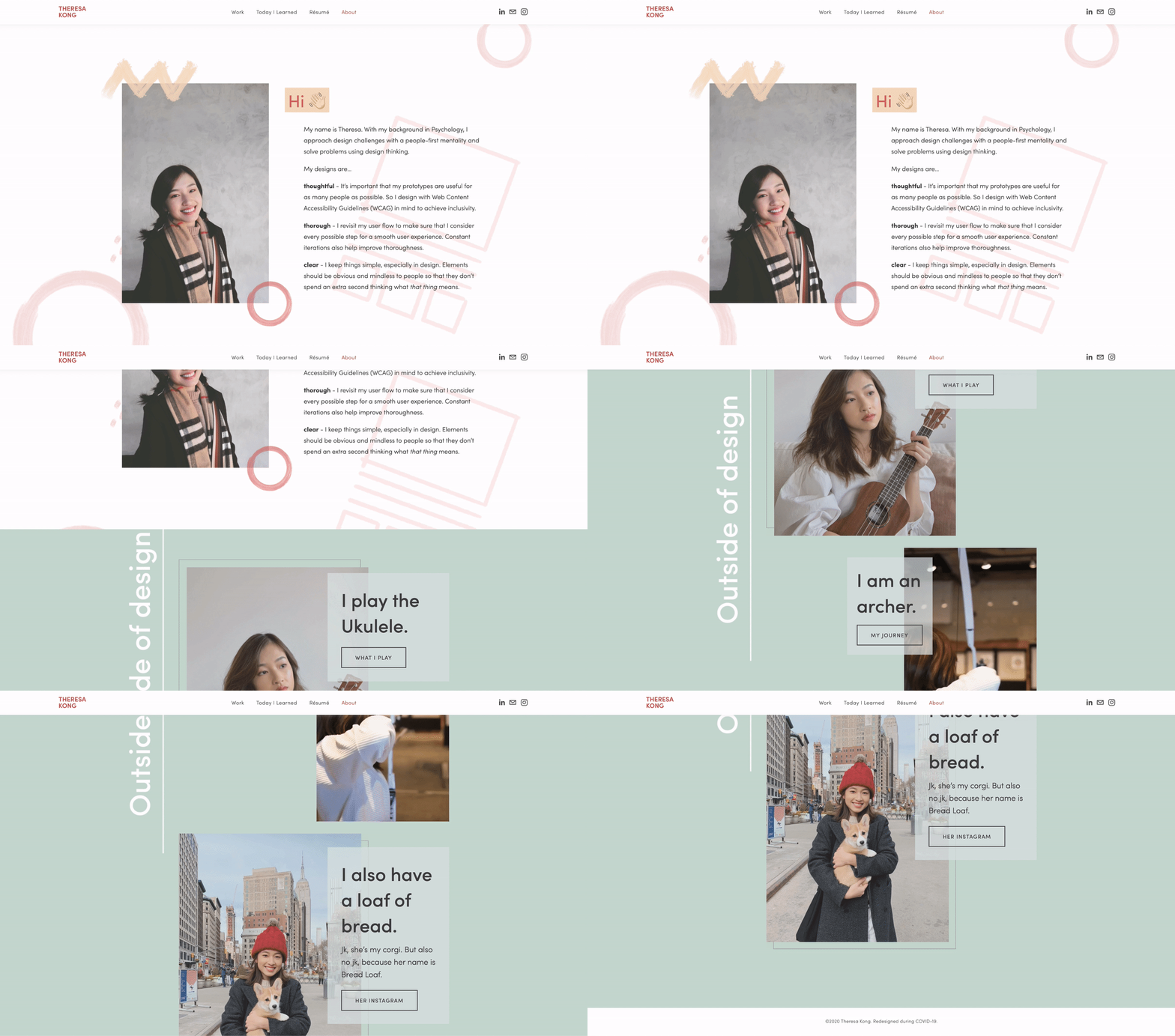
Problem 3: About page is too wordy
Solution: Break down content into digestible sections
My mistake was assuming that my visitors will read all that text.
Visitors can now skim through content with bolded or large texts. Parallax scrolling also adds another layer of effect that makes people notice the intentional scrolling animation. For example, the “Outside of design” section slowly appears as visitors scroll down, making them notice that it is a transitional point that introduces my other fun facts.
Extra Details For A Better Experience
Readability & Accessibility
Text color passes the WCAG Level AAA with a contrast ratio of 9.58:1 to make sure that those who might be visually impaired can still read the text.
Ease of Navigation
No matter how far visitors scroll down, the navigation bar always stays at the top for easier access to other pages.
Interaction Adds Visual Interest
Device mockup enlarges upon hovering to draw visitors’ attention.
Increasing brand exposure across multiple platforms
Résumé reuses the name logo, brand colors & typography
LinkedIn cover photo on my profile page contains my name, illustration and role as a UX designer.
Surprise! Here’s a challenge for you:
28 people took on the challenge!
What do they remember the most about my portfolio redesign?
Some even left me detailed feedback
My Takeaways
💡Show your thoughts, but make it flow.
The (re)design part is only half the work. The biggest lesson I’ve learned is gathering my thought processes and organizing it in a logical manner. It’s easy to get lost while making designs, but through documenting my processes and thinking back to why I made that design decision, then I can clearly and articulate my points.
💡Concise, concise, concise.
People’s attention span = short
Information should be = short but sufficient
Concise enough? 😏
💡Most importantly, enjoy the process!
The most rewarding part is asking for people’s feedback and making iterations. It excites me when there are responses coming in; these are the people who make the effort to leave me comments. I learned that no matter which design phase I am in, I should go the extra mile and make it fun!


