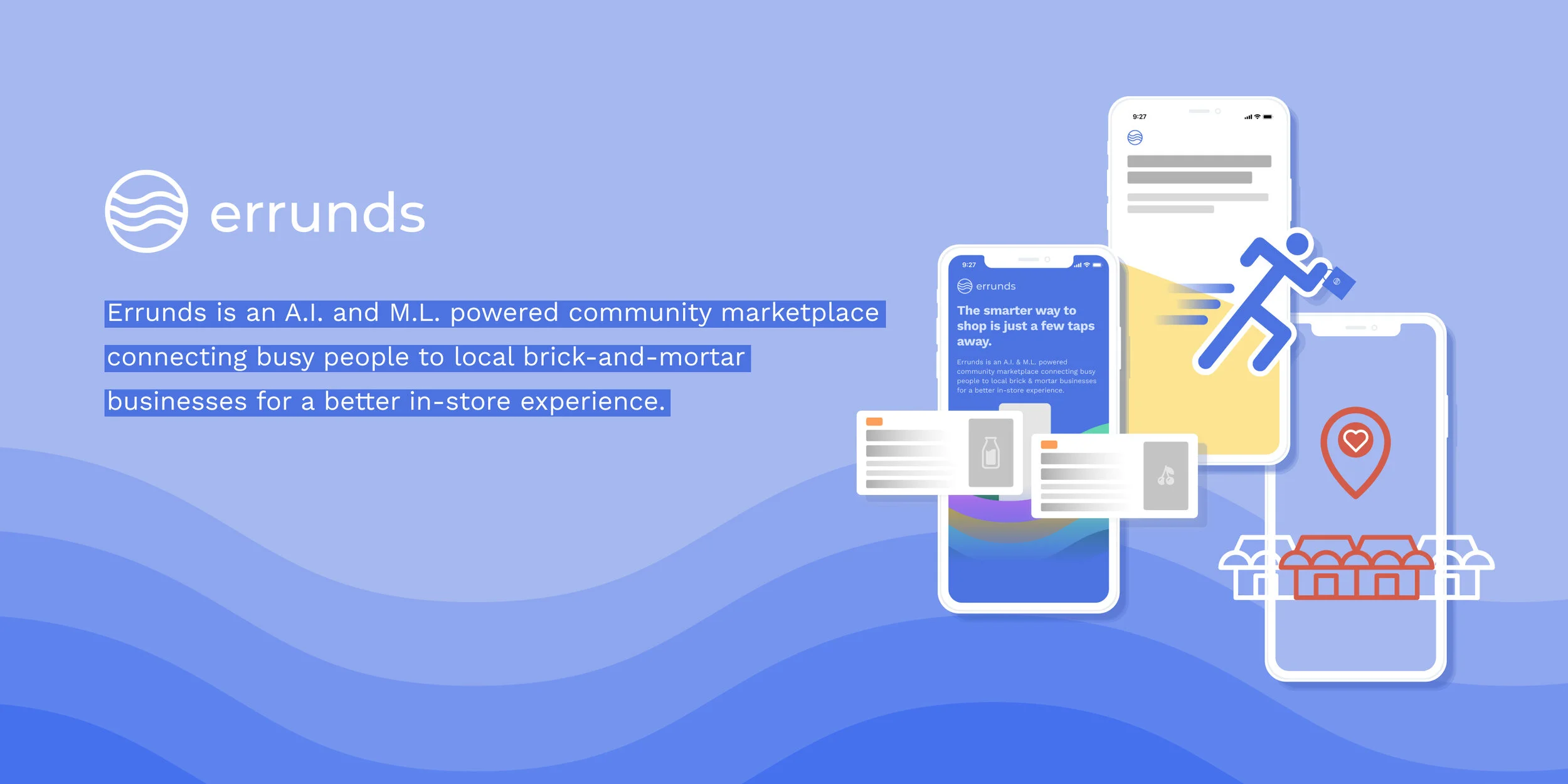

The Problem Space
The founders created Errunds because they saw that when people needed to go run errands, they would either go to big chain stores, or they impatiently wait in line to check out, or both.
Errunds wants to help people discover their local brick-and-mortar stores. Why not start with one of NYC’s iconic places, bodegas? They have almost everything and are accessible to many New Yorkers, but they are somewhat forgotten. We are curious to know why.
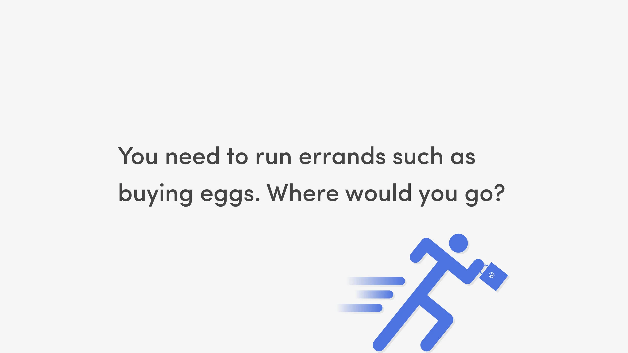
Interviews
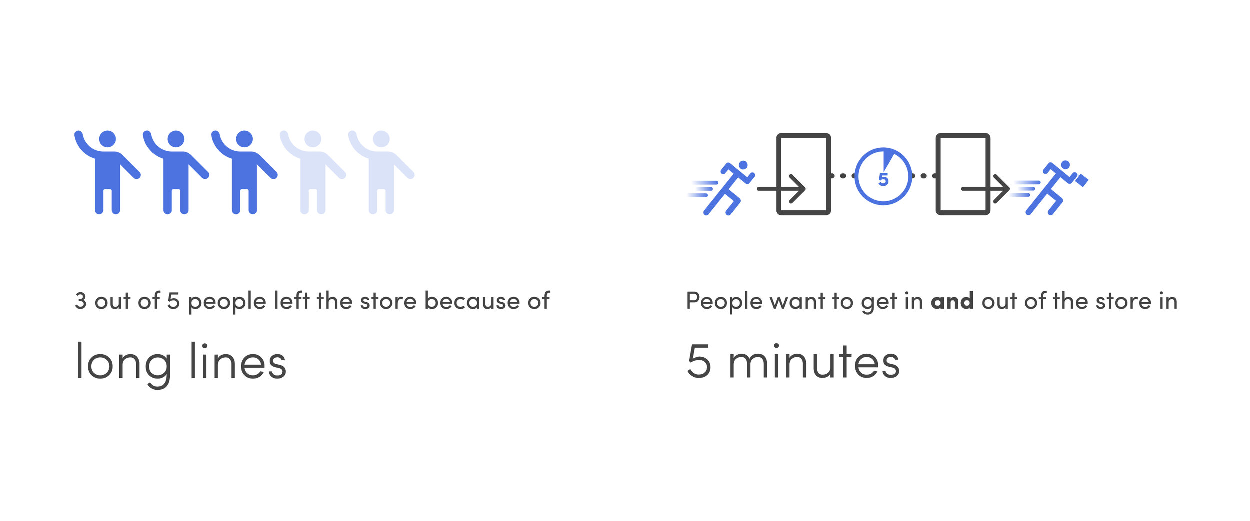
We interviewed 5 people who shop at bodegas, hoping to understand their habit, pain points and motivations.

How might we enhance people’s in-store shopping experience by helping them quickly find the things that they are looking for in their local brick-and-mortar shops?

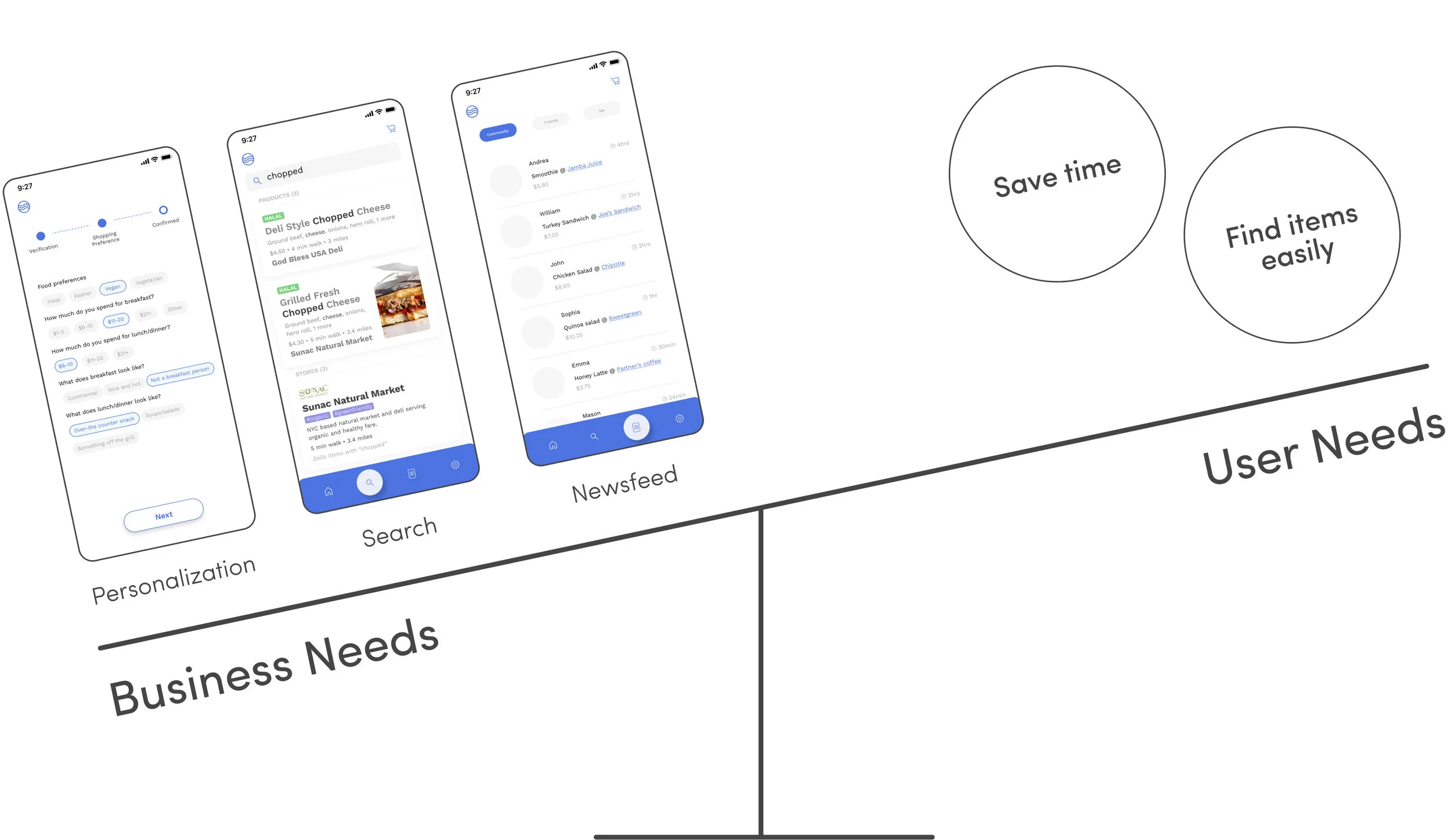
The imbalance of business and user needs
There were initial designs of features that the product owners wanted. While these business needs might make the product stand out, there were more pressing problems that the users face based on previous results from the user interview. How did we balance business and user needs?
Collaboration
We brought in developers and asked them how feasible it would be to include these features. They also agreed that the initial MVP should be as lean as possible. The product owners were able to see the user’s and developer’s perspectives and agreed to wait until Version 2 to implement these more advanced features. While we had to make tradeoffs, we can now all focus on addressing user needs of finding items easily and saving time.

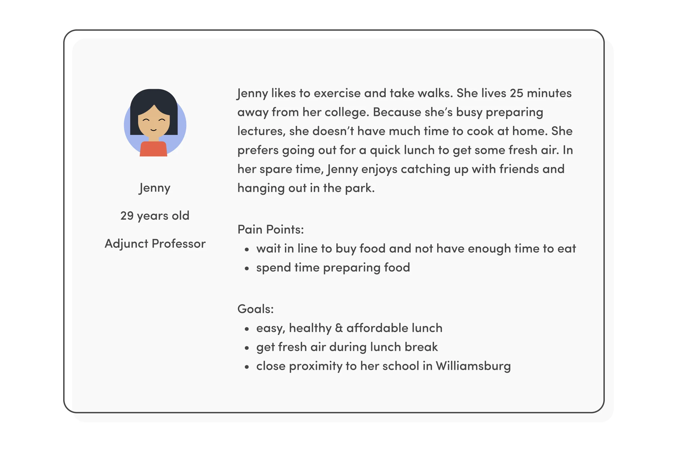
Target Audience
Our founders at Errunds decided to focus on teachers in the Williamsburg area. Based on our interviews, we created a persona as well as used the Value Proposition Canvas to validate that there is a fit between the product and the market.
Persona & Value Proposition Canvas
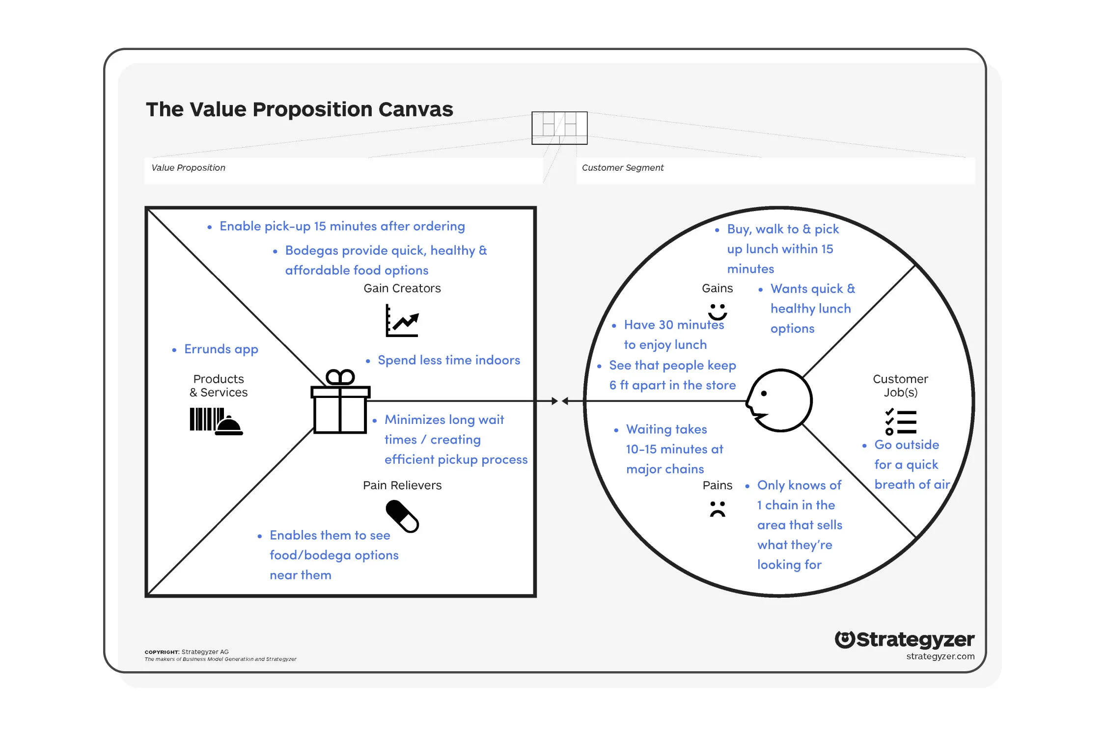
Errunds’ Value Propositions
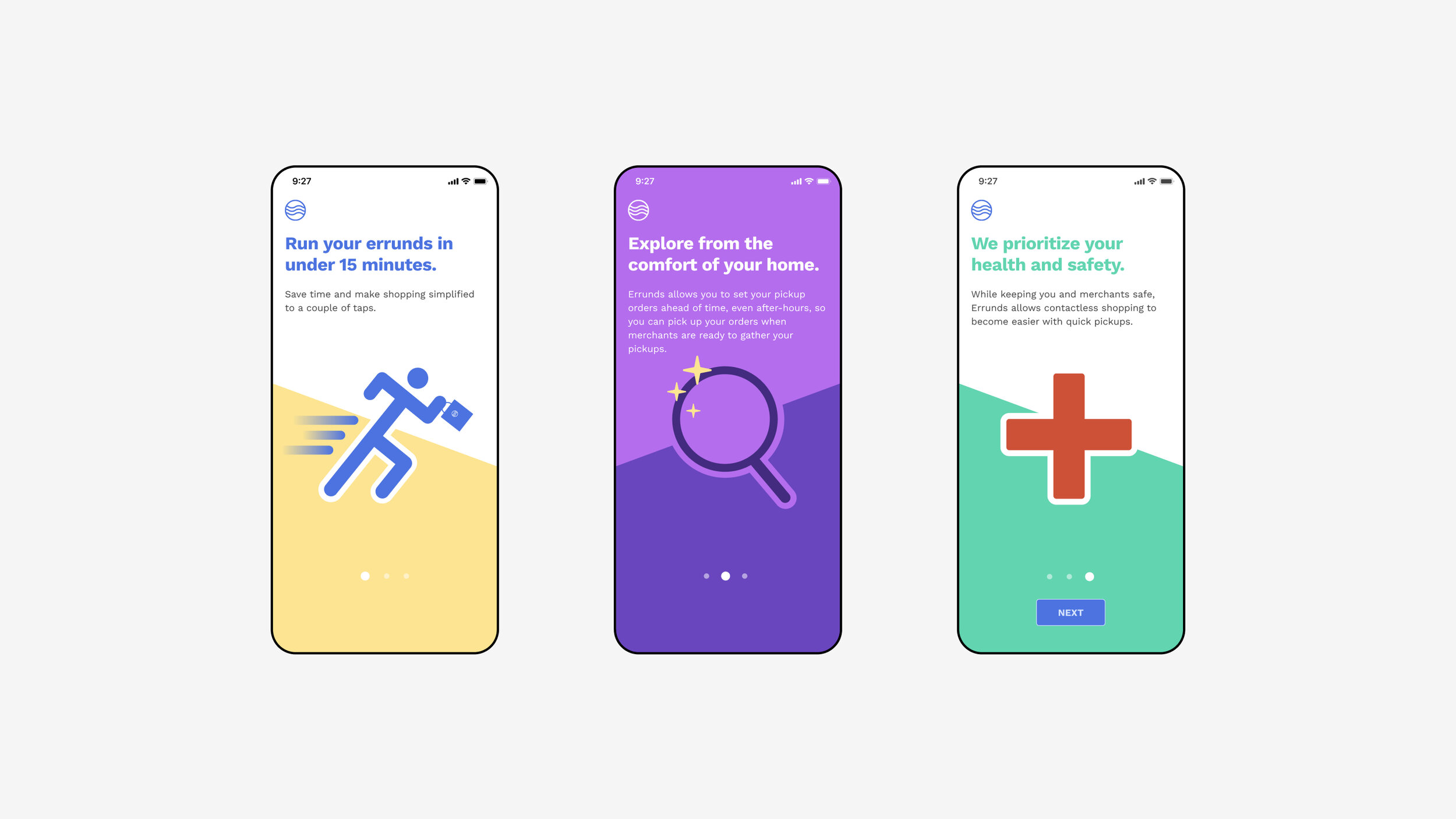
Illustrations designed by me
Information Architecture of Menu
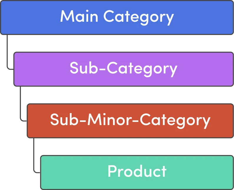
A typical bodega can have thousands of items. To determine the hierarchy and organize items properly, why don’t we mimic a physical shopping experience, finding the categories at the top of each aisle at a physical store? Using this logic, we organized items into a Tree Hierarchy. This way, it is easier for users to know where they can find specific items.

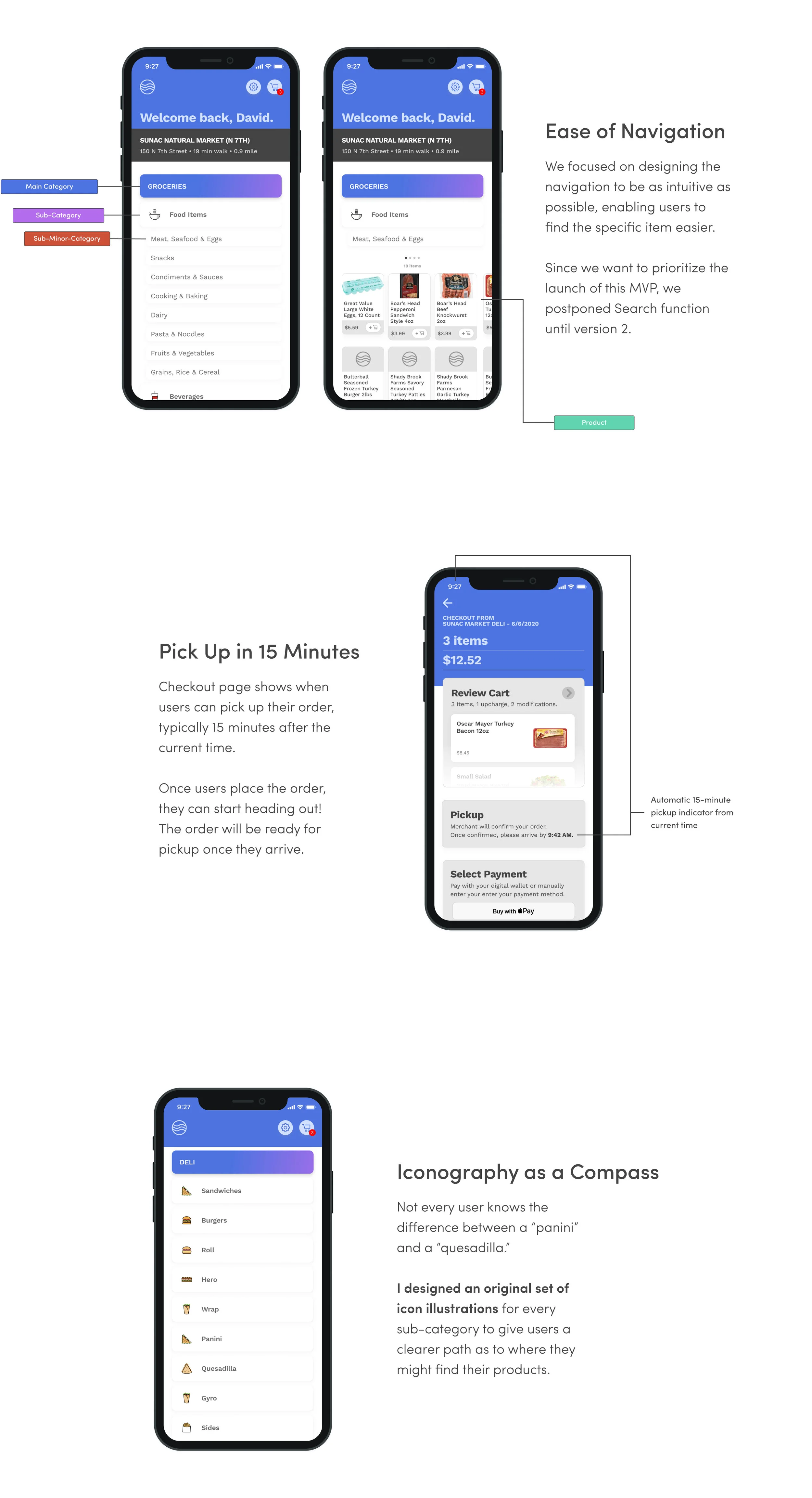
Errunds Iconography Illustration
Deli illustrations designed by me using Figma

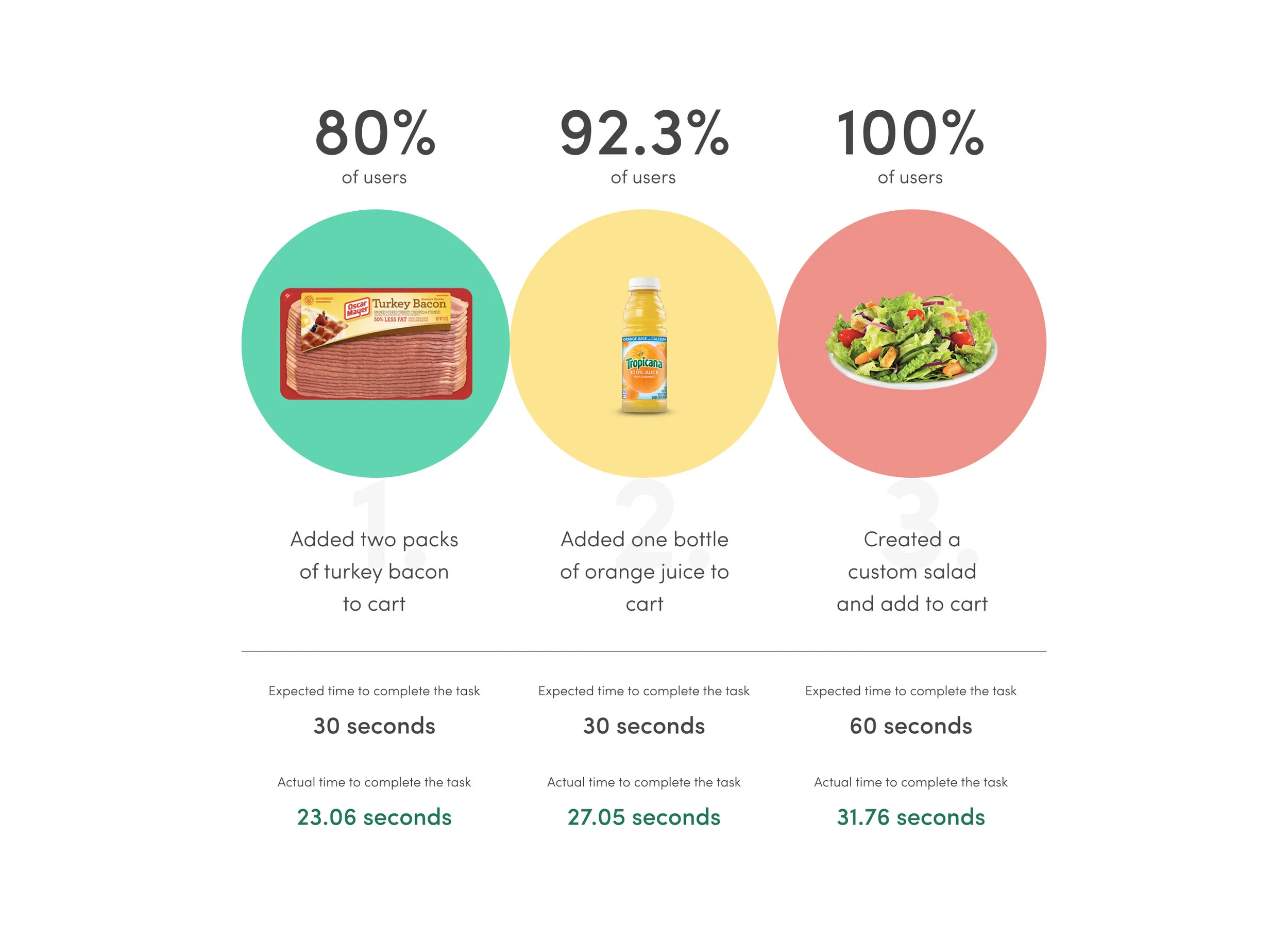
Usability Testing
We wanted to test our prototypes even when the product has not launched yet. We used Maze Design to conduct an unmoderated usability testing on 15 users to evaluate the effectiveness of our designs.
Takeaways
Over-Communicate to Collaborate
I’ve learned that constant communication and honest feedback are crucial for collaborations in cross-disciplinary teams. It’s always better to over-communicate; this is how teams can be on the same page faster and work towards one goal.
Balance Business Goals and User Needs
It’s understandable when a company has to meet important business goals. But a product can only be better if it centers around the users—it’s the people who are using the product! While it’s a common struggle to balance business goals and user needs, I learned that taking smaller steps can help mitigate.
Take Initiatives and Create Something New
I took many opportunities to build the product from the ground up. For example, being able to lead and design a library of original illustrations made me realize that I can turn possibilities into reality. I never know how much more I can achieve until I take the initiative!